We live in a society where social media is a daily presence in most of our lives. We saturate ourselves with pretty pictures and lives that seem perfect because, let's not kid ourselves, most of us are only looking for our best side to share with the world. But, if you dig a little deeper, behind that exposure of something ideal there may be hidden chaos.
We must assume that having problems and making mistakes is what is really part of our lives and, whether we like it or not, they are our best teachers.
It is hard to show that vulnerable side and we don't think about the fact that perhaps, as sometimes happens in music, the most valuable thing we have is not always the most "known" or the one we give the most visibility to.
Isn't it easier to identify with a mistake made than with perfection? Isn't it helpful to see how someone has come out stronger from a complicated situation we may be sharing?
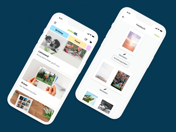
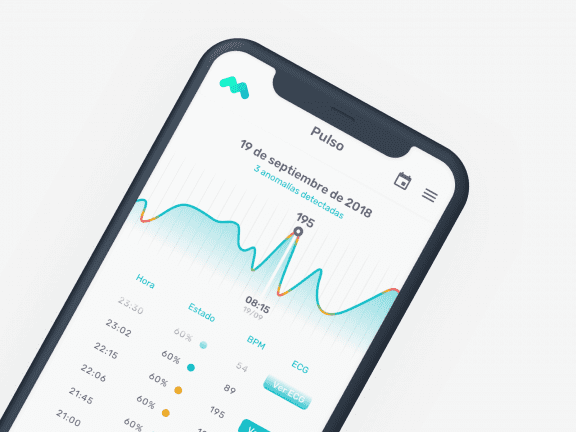
In design the same thing happens, we work to present an impeccable interface, with seamless navigation, and sometimes we forget to strive for the one thing that is certain in an app or website: users make mistakes.
Transforming those mistakes into as pleasant an experience as possible should be considered a goal and not an add-on. Moreover, it would be valuable to use those mistakes to give them personality, thus expressing a brand identity.
It is about designing in the same way, and with the same effort, both for the things that always work well and for the things that can go wrong at some point. Errors that are seemingly harmless are actually of great importance to the user experience.
We must establish a good and lasting relationship between product and user. Like any relationship, it costs more to maintain it than to achieve it, so we must polish the things that can frustrate one of the parties. A bad error message either frustrates and makes the user give up, or ends up becoming a meme in the worst case scenario.
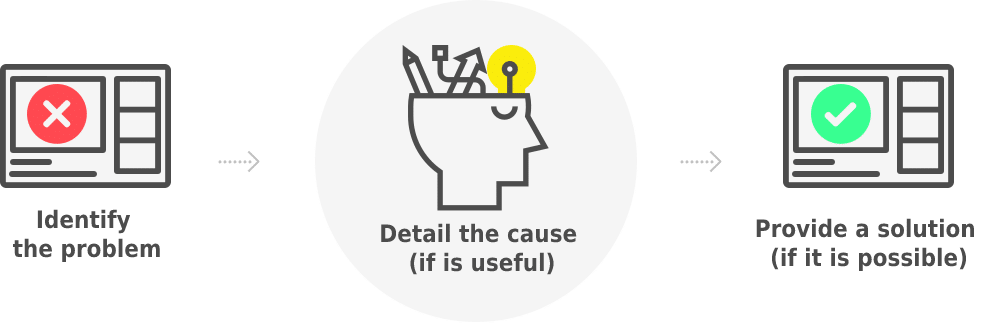
The UX design manager is the one who best knows the sequence of a user's actions, and who can most easily anticipate error cases. Among their tasks is to identify the most frequently completed flows and understand their dependencies.
At this point it is essential to work closely with the development team to convey where the information displayed in the app or website is collected from, and which processes use services that may fail. This helps to provide a more complete context for the user.
Keys to error page or message design
Considering the following guidelines will help us keep a good user experience under control when that error page or that annoying warning interrupts the expected flow.
Unambiguous
- Use simple, logical and concise language.
- Give a brief description that gives a clear idea of the problem and how to solve it, discarding technical terms and keeping only the relevant details.
- Use [Description of the bug] [How to fix this bug] as the basic structure.
- Expressing an error with generic text such as "There has been an error" is as useless as turning the square in Tetris, although in this case at least it serves as an example of what not to do.
With progressive disclosure
If there is information that is less necessary but is required to be available, it should be placed in a section, accompanied by a Show/Hide option.
No convictions
- Warn without blaming, avoiding words with negative connotations and in capital letters. Explain the desired action rather than pointing out where it went wrong.
- Use an active voice to accept responsibility when something goes wrong on our side. For example, "We could not attach your image" instead of "You could not attach your image".
- Using a passive voice for mistakes made by the user helps to smooth over an annoying situation.
With the right tone
- Tone is how an error is conveyed and will depend on the seriousness of the error.
- Use a tone in accordance with the image you want to show. Combine it with a touch of humour, when necessary and as long as you know the audience, so that it provides complicity with the user (this is so important when communicating digitally).
- We must not forget that we are dealing with people and we must communicate errors as if we were not digitally spread, providing guidance in the process being carried out.
Accompanying actions
- Some errors may require a button or link to correct it and, depending on how the alert is displayed, a button to perform the dismiss action may also be needed.
- Provide appropriate actions to lead the user through the next steps. The text of buttons and links should make sense when read in isolation, which also helps screen reader users.
Giving context
- Display the alert at the right time and place.
- Putting the error in context by placing it close to the area it belongs to makes it much easier to solve.
- The questions to be answered are: what triggered the message, when and where does it appear, how can the error be linked to its section visually and non-visually?
Bringing style
- Provide contrast between the colour of the text and the background. Think about accessibility, making use of icons, symbols and images to complement and humanise the design.
- Opt for the range of colours that people already associate with circumstances of danger or error, such as red, or alert, such as orange or yellow.